Paint Colors for Living Room: Choosing Shades That Shape Comfort and Style
Living rooms carry a special responsibility inside a home. Conversations happen there, guests gather there, and many families spend their most relaxed hours in that space. Color on the walls quietly shapes how the room feels during all those moments. A thoughtful paint color can make a room feel larger, calmer, brighter, or more welcoming without changing furniture or décor.
Professional painting also plays a role in the final look. Homeowners in Fredericksburg and surrounding areas often rely on Alpha Painting LLC when they want smooth finishes and consistent color application that truly reflects the chosen shade. Paint color selection matters, yet proper surface preparation and expert application determine how that color finally appears on the wall.
Color selection should never feel rushed. Lighting, room size, ceiling height, and furniture style all influence how paint appears once it dries. A shade that looks perfect on a small sample card can feel completely different when covering four full walls.
Table of Contents
Why Living Room Color Matters More Than Most Spaces
Living rooms experience more visual exposure than almost any other area of a house. Bedrooms remain private, kitchens focus on functionality, and bathrooms serve practical needs. Living rooms sit at the center of social life.
Wall color becomes the background for furniture, artwork, flooring, lighting fixtures, and décor elements. Every object inside the room interacts with the wall color. A poorly chosen shade can clash with furniture fabrics or create a dull, lifeless atmosphere.
Light reflection also changes dramatically depending on color depth. Lighter shades bounce natural light around the room, which makes spaces feel open and airy. Darker tones absorb light and create a cozy, intimate atmosphere. Neither option is right or wrong. Success depends on how the room is used and how much natural light enters the space.
Professional painters also notice that color can visually change room proportions. A darker wall behind a sofa can add depth, while lighter surrounding walls make the space appear larger. Strategic color placement often produces better results than simply coating every wall with the same shade.
Neutral Paint Colors That Never Go Out of Style
Neutral tones remain the most popular living room choice across the country. Designers and professional painters recommend neutrals when homeowners want flexibility with furniture and décor.
Beige tones create warmth without overpowering the room. Soft beige shades pair beautifully with wooden furniture, cream sofas, and textured fabrics. Homes with traditional or transitional interiors often benefit from beige walls because the color adds subtle warmth without feeling heavy.
Gray tones continue to dominate modern interior design. Cool grays deliver a sleek and contemporary appearance. Warm grays, often called “greige,” mix gray with beige undertones and create a balanced atmosphere that feels comfortable rather than cold.
Taupe sits between brown and gray, offering another versatile option. Many homeowners appreciate taupe because it blends effortlessly with both cool and warm décor elements. Living rooms with mixed materials such as leather, wood, and metal often look cohesive with taupe walls.
Neutral colors also simplify future decorating decisions. New furniture, artwork, or rugs usually fit naturally against neutral walls. A homeowner can refresh the entire room simply by updating décor instead of repainting.
Warm Paint Colors That Create a Welcoming Living Room
Warm colors bring energy and personality into a living room. These shades contain undertones of red, orange, or yellow, which naturally feel inviting and comfortable.
Terracotta tones have grown increasingly popular in recent years. A muted terracotta wall creates warmth that feels earthy and grounded rather than loud. Homes with natural materials like wood beams, stone fireplaces, or leather furniture often look beautiful with terracotta-inspired colors.
Peach and soft coral shades provide warmth without becoming overpowering. These colors work especially well in living rooms that receive strong natural light throughout the day. Sunlight enhances the warmth and creates a soft glow across the walls.
Caramel tones provide richness while remaining neutral enough for everyday living spaces. A caramel-inspired wall color complements darker wood furniture and bronze lighting fixtures beautifully.
Warm colors tend to make large living rooms feel more comfortable and intimate. High ceilings or oversized spaces sometimes feel cold or empty with pale colors. Warm tones reduce that visual distance and create a cozy atmosphere for gatherings.
Cool Paint Colors for Calm and Relaxed Living Spaces
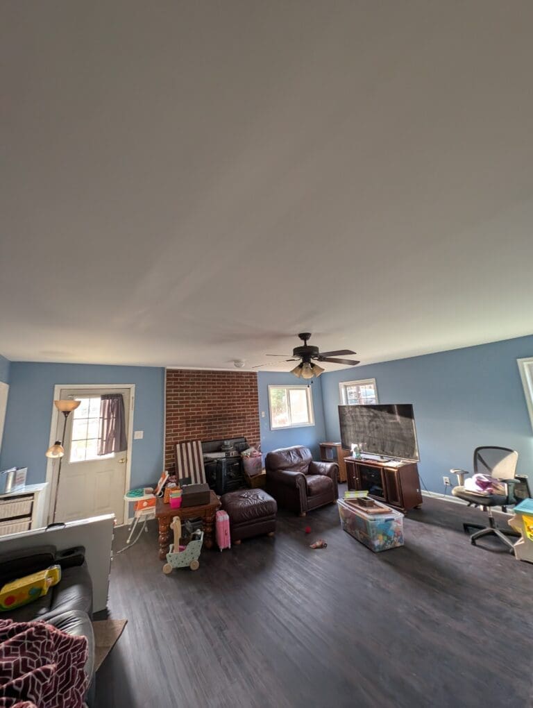
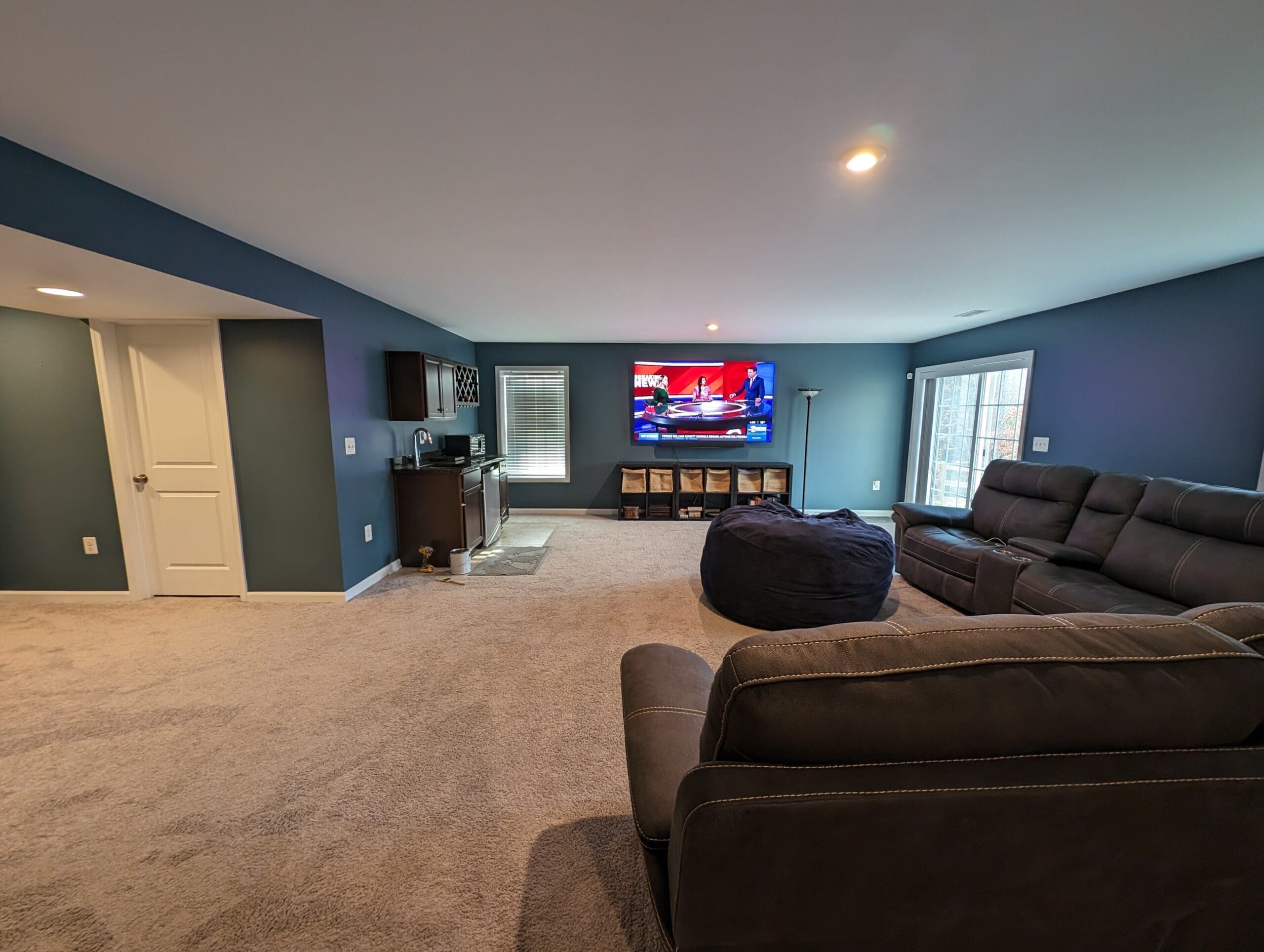
Cool colors introduce calmness and relaxation into a living room environment. Shades with blue or green undertones typically produce this effect.
Soft blue walls create a peaceful setting that feels open and refreshing. Light blue shades work particularly well in rooms with plenty of daylight. Natural light enhances the color and creates an airy atmosphere that feels bright but not harsh.
Sage green has become a favorite among interior designers. This muted green carries gray undertones, which prevent it from feeling too bold. Sage works beautifully with natural textures such as linen fabrics, woven baskets, and wooden furniture.
Dusty blue-gray shades provide a sophisticated appearance without overwhelming the room. These colors sit comfortably between traditional and modern design styles. Homeowners looking for subtle character often appreciate this balanced tone.
Cool paint colors perform especially well in warmer climates or homes with strong sunlight exposure. These shades visually cool the space and maintain a relaxed mood even during bright summer afternoons.
Bold Living Room Colors That Make a Statement
Bold colors can transform an ordinary living room into a visually striking space. Rich, dramatic shades bring personality and depth when used carefully.
Deep navy blue stands as one of the most reliable bold colors for living rooms. Navy creates elegance without feeling overwhelming. A navy accent wall behind a sofa or fireplace often becomes the focal point of the room.
Emerald green offers luxury and richness that few other colors achieve. This shade works best in living rooms with adequate lighting and lighter furniture pieces that balance the depth of the color.
Charcoal gray delivers a modern and dramatic appearance. Many homeowners choose charcoal for accent walls or built-in shelving areas. Pairing charcoal with white trim and warm lighting creates a sophisticated atmosphere.
Dark colors require careful planning. Rooms with limited natural light can feel smaller if every wall carries a deep shade. Accent walls, architectural features, or partial wall sections often provide the best opportunity for bold colors without overwhelming the space.
Lighting Changes Everything
Paint rarely looks the same under different lighting conditions. Natural daylight, warm incandescent bulbs, and cool LED lighting all change how color appears on the wall.
North-facing living rooms usually receive cooler light throughout the day. Warm paint colors balance that cool light and prevent the room from feeling dull. Beige, cream, and soft warm grays often perform well in these spaces.
South-facing rooms receive stronger sunlight. Cooler shades like soft blue, sage, or gray often look balanced under that light.
Artificial lighting also matters during evening hours when living rooms remain active. Warm light bulbs enhance beige, cream, and earth tones. Cool lighting can intensify blues and grays.
Paint samples should always be tested directly on the wall before committing to a full project. Small test patches placed on different walls reveal how the color shifts throughout the day.
Ceiling and Trim Colors That Support the Main Shade
Living room color design extends beyond the walls themselves. Ceiling and trim colors strongly influence how the primary wall color appears.
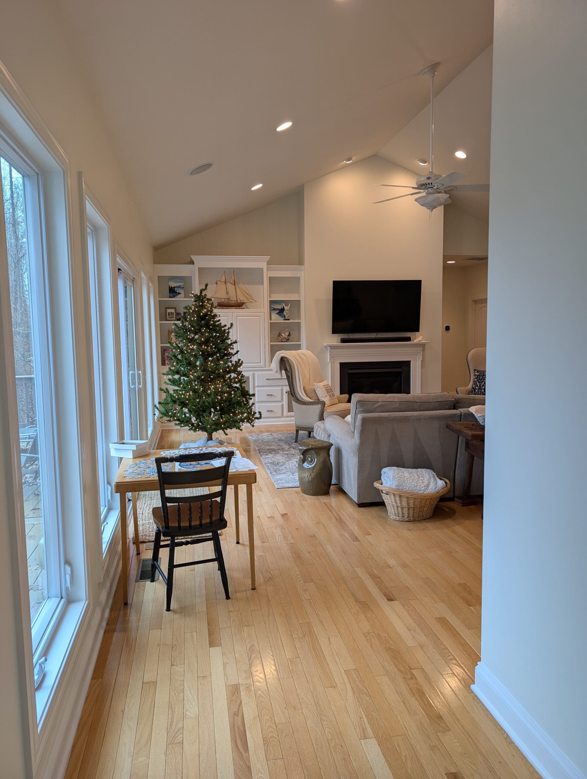
White ceilings remain the most common choice because they reflect light and maintain visual height. Crisp white trim also creates clean edges between walls and architectural elements.
Soft off-white ceilings can produce a warmer atmosphere in living rooms with beige or earth-tone walls. High ceilings sometimes benefit from slightly darker ceiling shades that bring the visual height down to a comfortable level.
Trim color often works best when it contrasts slightly with the wall color. Light gray walls paired with bright white trim create crisp definition around doors, windows, and baseboards.
Consistency across adjacent rooms also matters. Living rooms that open into dining rooms or hallways look more cohesive when paint colors transition smoothly rather than clashing.
Choosing Colors That Work With Furniture and Flooring
Wall color should never be chosen in isolation. Furniture upholstery, flooring materials, and decorative elements must work with the paint rather than compete against it.
Large furniture pieces influence color decisions heavily. A dark leather sofa pairs beautifully with warm neutrals or soft greens. Light fabric sofas often stand out nicely against deeper wall colors like navy or charcoal.
Hardwood floors also affect color selection. Floors with warm reddish undertones typically pair better with warm wall colors. Gray-toned floors often work best with cooler wall shades.
Rugs, curtains, and artwork add additional color layers to the room. Selecting a paint color that already appears somewhere within these elements helps unify the design.
Experienced painters often recommend collecting several room elements together before selecting paint. A cushion, rug sample, wood stain, and paint swatch placed side by side reveal whether the colors truly complement each other.
Final Thoughts
Living room paint colors influence mood, comfort, and overall design harmony more than most homeowners realize. Color choice interacts with lighting, furniture, architecture, and décor throughout the entire day.
Neutral shades provide flexibility and timeless appeal. Warm tones create welcoming environments for social gatherings. Cool colors support calm and relaxation. Bold shades add personality and drama when used thoughtfully.
Neutral shades provide flexibility and timeless appeal. Warm tones create welcoming environments for social gatherings. Cool colors support calm and relaxation. Bold shades add personality and drama when used thoughtfully.
A well-chosen living room color does more than decorate a space. It shapes how people feel when they enter the room, how comfortable conversations become, and how memorable the space feels for everyone who spends time there.