
Living Room Paint Ideas That Elevate Comfort, Style, and Character
Living rooms carry more visual responsibility than almost any other space in a home. Family gatherings, quiet evenings, entertaining guests, and daily relaxation all happen here. Color choices shape the mood of that environment more than furniture or décor. Thoughtful paint selection can make a room feel brighter, calmer, larger, warmer, or more refined.
Professional painters see this transformation daily. Careful preparation, quality coatings, and proper application methods ensure color performs exactly as intended. Homeowners in Virginia often rely on experienced teams such as Alpha Painting LLC in Fredericksburg when they want flawless interior finishes that bring these design ideas to life.
Paint decisions should consider lighting, furniture, ceiling height, and the overall personality of the home. A shade that looks stunning on a swatch can appear completely different once it covers four walls. Smart planning helps avoid that disappointment and produces a living room that feels intentional and welcoming.
Table of Contents
Warm Neutral Tones That Create a Comfortable Foundation
Neutral paint colors remain a reliable starting point for living rooms. Warm beige, soft greige, creamy ivory, and muted taupe create a calm environment that supports many decorating styles.
Natural light interacts beautifully with warm neutrals. Morning sunlight brings subtle warmth, afternoon light enhances depth, and evening lamps produce a cozy glow. Furniture and artwork also stand out clearly against these balanced tones.
Many homeowners appreciate how flexible these colors are over time. New furniture, rugs, or décor pieces can be added without repainting the entire room. Neutral walls act as a background that adapts easily to design changes.
Professional painters usually recommend testing large color samples before committing. Small paint chips rarely reveal undertones clearly. Large test areas show whether a beige leans yellow, pink, or gray once sunlight hits the wall throughout the day.
Warm neutrals also pair beautifully with natural materials like wood flooring, leather furniture, woven textiles, and stone fireplaces. The overall result feels relaxed yet polished.
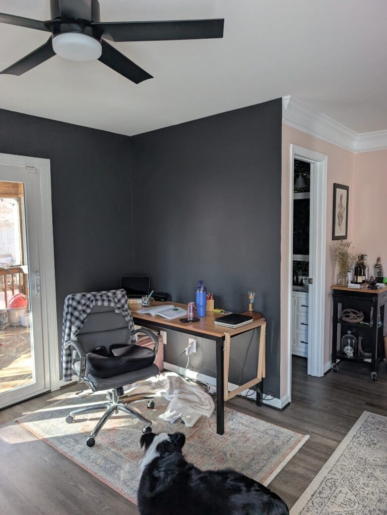
Statement Accent Walls That Add Depth and Personality
Accent walls continue to be one of the most effective ways to introduce bold color into a living room without overwhelming the space. A single painted wall creates visual focus and adds architectural interest.
Placement matters. Walls behind fireplaces, entertainment centers, or large sofas often serve as natural focal points. Darker tones work well here since they anchor the room visually.
Charcoal gray, forest green, navy blue, and deep terracotta have become popular choices. These shades provide strong contrast against lighter surrounding walls while maintaining sophistication.
Paint finish also affects the final look. Matte or eggshell finishes absorb light and create a smooth modern appearance. Satin finishes reflect more light and emphasize color richness.
Accent walls succeed when the rest of the room remains balanced. Coordinating throw pillows, artwork, and decorative items tie the color together and make the design feel intentional rather than random.
Earthy Greens That Bring Calm and Natural Balance
Green has become one of the most requested living room colors in recent years. Soft sage, olive, moss, and eucalyptus tones introduce a sense of calm that connects interior spaces with nature.
These colors work particularly well in homes that feature large windows, indoor plants, or natural wood finishes. The visual connection between greenery outdoors and painted walls indoors creates a peaceful atmosphere.
Sage green remains a favorite choice for homeowners seeking subtle color without overpowering the room. This tone carries enough gray to stay soft while still adding personality.
Olive green provides a deeper and more dramatic option. Rooms with strong natural light benefit most from this shade since sunlight prevents the color from appearing too dark.
Designers often pair green walls with warm metals like brass or gold accents. Light wood furniture, woven textures, and neutral fabrics enhance the natural feeling of the space.
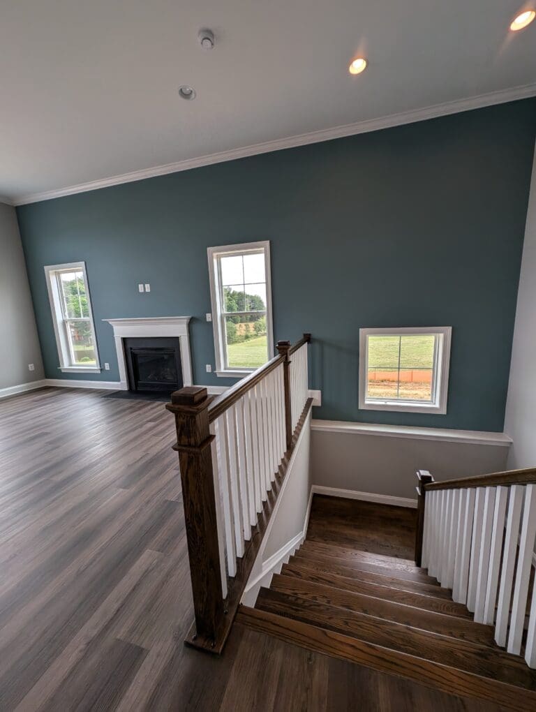
Deep Blues That Add Sophistication and Depth
Blue tones create a strong sense of comfort and elegance in living rooms. Deep navy, steel blue, and muted slate tones introduce richness without feeling heavy.
Navy blue walls offer dramatic contrast against white trim, crown molding, and built-in shelving. The crisp separation between dark walls and bright trim highlights architectural details beautifully.
Steel blue sits between gray and blue, making it extremely versatile. This color complements modern furniture, traditional décor, and coastal-inspired interiors equally well.
Lighting conditions should always guide darker paint decisions. Rooms with larger windows can handle deeper shades more easily. Artificial lighting can also soften darker colors during evening hours.
Many painters recommend pairing deep blue walls with lighter ceilings and trim. That contrast keeps the room feeling open and prevents the darker color from closing in the space visually.
Two-Tone Walls That Add Architectural Interest
Two-tone paint designs bring creativity into living room walls without requiring complex decorative techniques. The approach divides the wall horizontally using two coordinating colors.
Lower wall sections often feature deeper tones such as navy, charcoal, or olive. Upper sections stay lighter to maintain brightness and visual balance.
Chair rail molding or simple painted dividing lines help separate the two colors cleanly. Crisp edges require careful taping and steady application techniques.
This style works particularly well in homes with higher ceilings. The color transition adds character and helps define the proportions of the room.
Two-tone walls also complement classic interior styles like colonial, farmhouse, or transitional design. The technique feels timeless yet visually interesting.
Ceiling Color Choices That Transform the Entire Room
Ceilings often remain plain white, yet thoughtful ceiling color can dramatically improve a living room’s character. Paint overhead surfaces influence how tall or spacious a room feels.
Soft off-white ceilings with subtle warmth help connect with neutral wall colors. This slight variation prevents the ceiling from appearing stark or disconnected.
Light gray ceilings pair beautifully with modern living room designs. The tone adds sophistication without darkening the room.
Rooms with tall ceilings sometimes benefit from slightly darker ceiling paint. This technique visually lowers the ceiling and makes the space feel more intimate.
Painted ceilings also work well with crown molding. Crisp trim lines separate wall color from ceiling color and add a polished architectural touch.
Proper lighting placement highlights ceiling paint effectively. Recessed lighting and decorative fixtures create gentle shadows that enhance color depth.
Paint Finishes That Affect Appearance and Durability
Color selection gets most of the attention, yet paint finish plays an equally important role in how living room walls perform.
Flat or matte finishes create a soft modern appearance that hides minor wall imperfections. These finishes absorb light and reduce glare, making them ideal for large wall surfaces.
Eggshell finishes offer a slight sheen that improves durability while maintaining a smooth look. Many professional painters prefer eggshell for living rooms since it balances beauty with easy cleaning.
Satin finishes provide higher durability and subtle shine. Homes with children or frequent entertaining sometimes benefit from satin since the surface resists marks and wipes clean more easily.
Surface preparation greatly influences the final result. Walls must be properly patched, sanded, and primed before applying finish coats. Careful preparation ensures the chosen finish looks smooth and consistent.
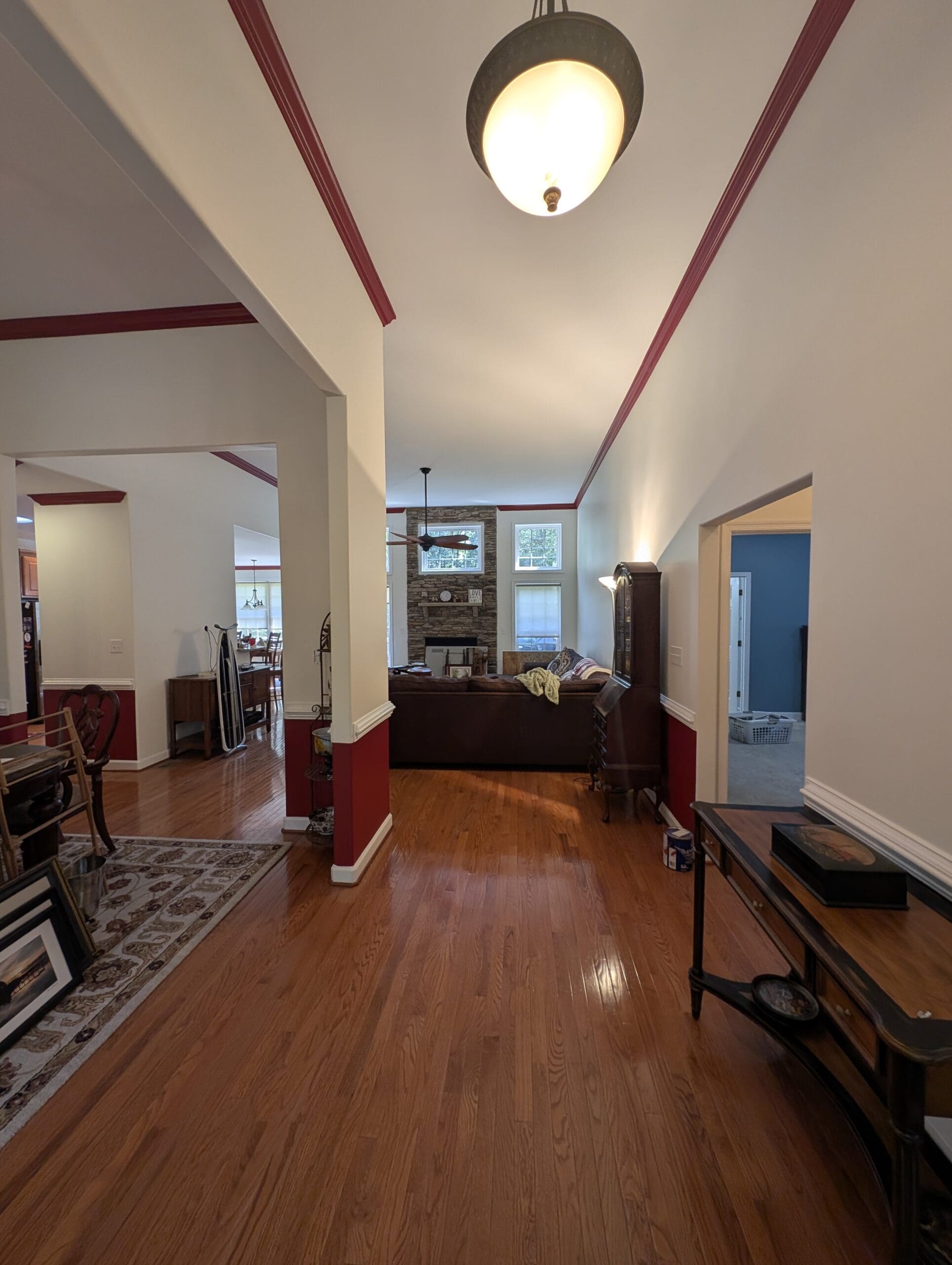
Creating Flow Between the Living Room and Adjacent Spaces
Living rooms rarely exist in isolation. Open floor plans connect them with dining areas, kitchens, hallways, and entry spaces. Color choices should complement nearby rooms rather than compete with them.
Subtle transitions between spaces help maintain visual harmony. Slightly different shades within the same color family often work best.
Neutral living rooms can connect easily with dining rooms painted in deeper tones or kitchens with crisp white cabinetry. Accent walls sometimes act as a bridge between two spaces.
Trim color also plays a significant role in maintaining continuity. Consistent trim across connected rooms ties everything together even when wall colors vary.
Paint planning becomes especially important in homes with open layouts. Careful coordination creates a smooth visual flow that makes the entire house feel thoughtfully designed.
Lighting and Paint Color: A Relationship That Changes Everything
Lighting dramatically alters how paint colors appear. Sunlight, warm bulbs, cool LED lighting, and shaded windows all influence the final perception of color.
South-facing rooms receive strong natural light that intensifies paint colors. Slightly softer tones often perform better in these spaces.
North-facing rooms receive cooler light that can make colors appear muted. Warmer paint tones help balance that effect.
Evening lighting deserves attention as well. Living rooms often serve as relaxation spaces at night, so paint should look comfortable under lamps and overhead fixtures.
Testing paint samples during different times of day provides the clearest picture of how the final color will behave.
Thoughtful Paint Choices Create Living Rooms People Love Spending Time In
Paint may seem like a simple upgrade, yet the right color transforms how a living room feels and functions. Warm neutrals provide timeless flexibility. Deep blues and greens introduce character and elegance. Accent walls, ceiling colors, and two-tone designs bring creative detail into the space.
Professional preparation and skilled application ensure those colors look smooth, balanced, and long-lasting. Careful color testing, lighting awareness, and coordination with furniture and décor produce a living room that feels welcoming every day.
Professional preparation and skilled application ensure those colors look smooth, balanced, and long-lasting. Careful color testing, lighting awareness, and coordination with furniture and décor produce a living room that feels welcoming every day.
A well-painted living room becomes more than a gathering space. The room turns into a comfortable centerpiece of the home where conversations happen easily, guests feel welcome, and quiet evenings feel even more relaxing. Thoughtful color choices make that transformation possible.